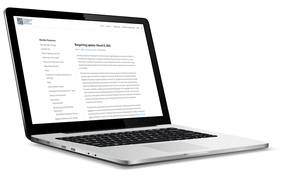
The University of Lethbridge Faculty Association (ULFA) serves its members through collective bargaining, representation and protection of member rights.
We were tasked with turning a text-heavy website into a colourful, intuitive site that was user-friendly for staff, while also performing a materials audit to ensure that materials are effective for their audiences.
OBJECTIVES
- Create an engaging and intuitive website, with user-friendly templates and tools that have a coherent look and feel.
- Improve communication with members, enhancing member understanding of the supports provided by ULFA.
- Raise the profile of the ULFA in the community, and how members contribute to the local economy and quality of life in Lethbridge.
Our Approach
For the website:
- Developed a relationship with ULFA, walking them through each step of our process.
- Built an initial site wireframe to establish content organization and user navigation .
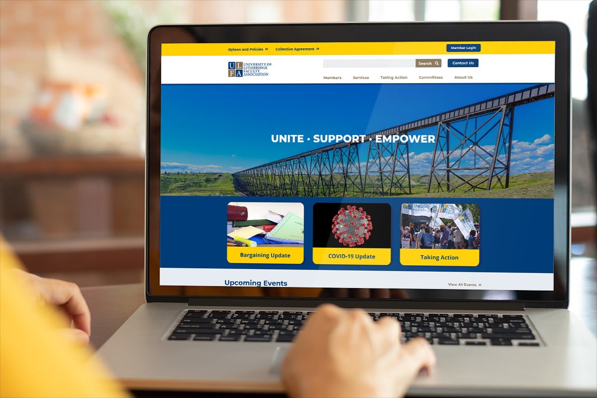
- Created a design with bold colours and images to engage users.
- Edited and revised content to fit their goals and better reach their target audiences.
We worked with key people from ULFA to understand their needs. We discussed how to position ULFA both within the university and the community. We reviewed their web statistics to understand the most viewed pages and reflected that content as a priority on the new website. We recommended more images and robust colours to better convey the culture of the organization. The new design was presented to the client for approval.
We spent time going over details with the client, ensuring they were informed and engaged in every step. They user-tested the site, reviewed it with the ULFA Board and gave its final approval.
For the audit:
- Examined materials to identify strengths, weaknesses, and gaps.
- Provided a comprehensive report of all recommendations.
We ran selected materials through our custom rubric to detail objective and subjective factors that affect readability, design and overall appeal. We created a comprehensive report, outlining the various results, and highlighted recommendations to make the materials more effective.
The Result
Focus went above and beyond from start to finish to give us exactly what we needed. They took the time to meet with us to really get a feel for our organization and executed accordingly. We would highly recommend them.
Eva Cool, Administrative Officer, ULFA
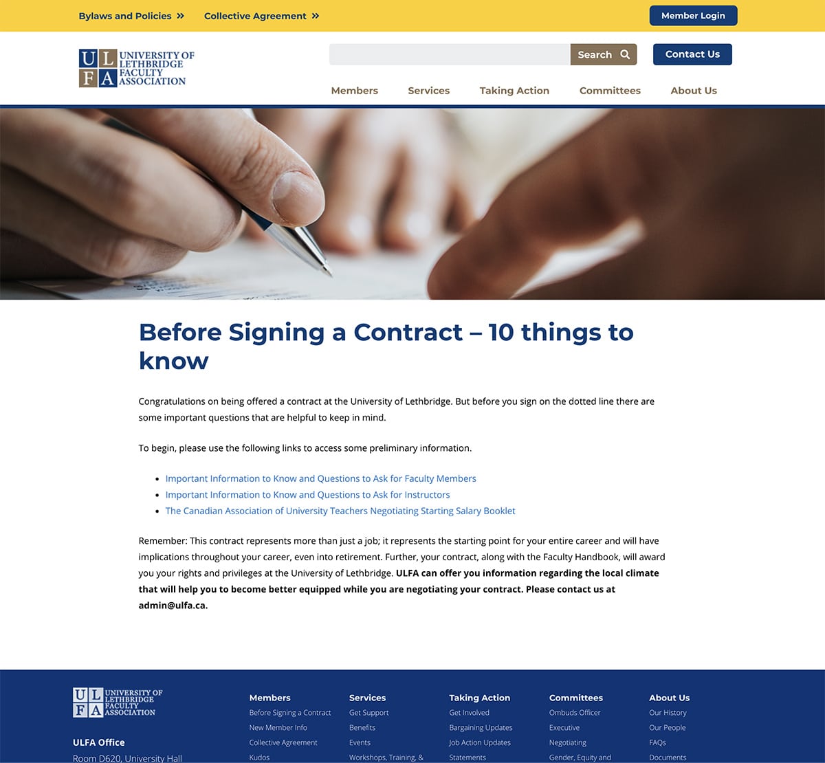
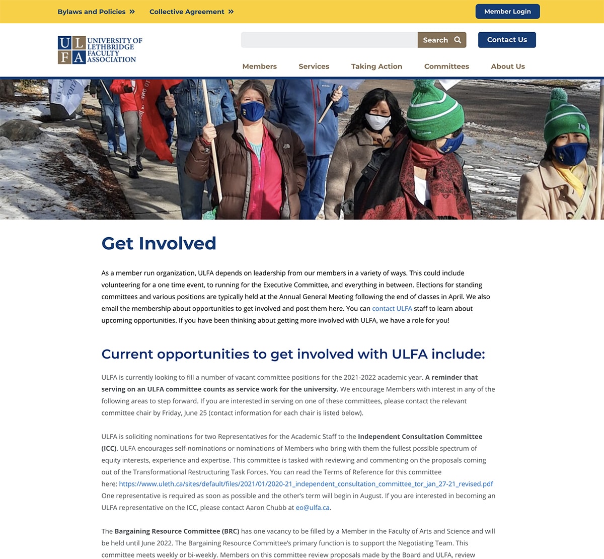
The new site is colourful, eye-catching, and user-friendly. The materials ULFA uses are strategic and mindful of their audiences. We helped them create a highly visual website that will engage their members, and capture the attention of new members with information that is clear and easy to find.
Want to see what we can do for your website?


